We've just updated MediaWiki and its underlying software. If anything doesn't look or work quite right, please mention it to us. --RanAS
Power Mario Contest: Difference between revisions
From SnesLab
Vitor Vilela (talk | contribs) (Add screenshots) |
(→Summary: superscripted) |
||
| (One intermediate revision by the same user not shown) | |||
| Line 2: | Line 2: | ||
[[File:PMCEntry NoWatermark.png|thumb|Anas' Entry, shown in the Main Page!]] | [[File:PMCEntry NoWatermark.png|thumb|Anas' Entry, shown in the Main Page!]] | ||
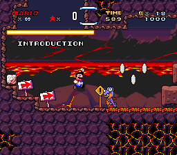
[[File:daizo-pmc-entry.png|thumb|Daizo Dee Von's Power Mario Contest entry.]] | [[File:daizo-pmc-entry.png|thumb|Daizo Dee Von's Power Mario Contest entry.]] | ||
Power Mario Contest was the 2019 Super Mario World Hacking contest where anyone can use any resources to make a level, similar to SMW Central's "Chocolate Level Design Contest". While only 7 people competed, the effort each entry provides serves as a reminder of why people hack [[Super_Mario_World|Super Mario World]] in the first place. | '''Power Mario Contest''' was the 2019 Super Mario World Hacking contest where anyone can use any resources to make a level, similar to SMW Central's "Chocolate Level Design Contest". While only 7 people competed, the effort each entry provides serves as a reminder of why people hack [[Super_Mario_World|Super Mario World]] in the first place. | ||
== Entries == | == Entries == | ||
| Line 26: | Line 26: | ||
! Place !! Author !! FURiOUS !! Sinc-X !! Tob !! Total | ! Place !! Author !! FURiOUS !! Sinc-X !! Tob !! Total | ||
|- | |- | ||
| | | 1<sup>st</sup> || Super Maks 64 || 98 || 98 || 94 || 97 | ||
|- | |- | ||
| | | 2<sup>nd</sup> || Daizo || 97 || 69 || 77 || 81 | ||
|- | |- | ||
| | | 3<sup>rd</sup> || Anas || 90 || 71 || 80 || 80 | ||
|- | |- | ||
| | | 4<sup>th</sup> || TDW || 85 || 61 || 71 || 72 | ||
|- | |- | ||
| | | 5<sup>th</sup> || Blue Mario || 87 || 45 || 36 || 56 | ||
|- | |- | ||
| | | 6<sup>th</sup> || Manofer || 67 || 57 || 38 || 54 | ||
|- | |- | ||
| | | 7<sup>th</sup> || Mclegend101 || 20 || 31 || 5 || 19 | ||
|} | |} | ||
Latest revision as of 12:46, 18 July 2023
Power Mario Contest was the 2019 Super Mario World Hacking contest where anyone can use any resources to make a level, similar to SMW Central's "Chocolate Level Design Contest". While only 7 people competed, the effort each entry provides serves as a reminder of why people hack Super Mario World in the first place.
Entries
- AnasMario130 with "Pyro-Blue's Fort"
- Blue Mario with "The End of Spring".
- Daizo Dee Von with "Faktori Volcano".
- Manofer with "I hate Thwomps".
- Mclegend101 with "YOSHI'S ISLAND 1".
- Strikeforcer with "Koopakick Factory!"
- Super Maks 64 with "even further over there".
Results
- First place: Super Marks 64 - 97/100
- Second place: Daizo Dee Von - 81/100
- Third place: Anas - 80/100
Summary
| Place | Author | FURiOUS | Sinc-X | Tob | Total |
|---|---|---|---|---|---|
| 1st | Super Maks 64 | 98 | 98 | 94 | 97 |
| 2nd | Daizo | 97 | 69 | 77 | 81 |
| 3rd | Anas | 90 | 71 | 80 | 80 |
| 4th | TDW | 85 | 61 | 71 | 72 |
| 5th | Blue Mario | 87 | 45 | 36 | 56 |
| 6th | Manofer | 67 | 57 | 38 | 54 |
| 7th | Mclegend101 | 20 | 31 | 5 | 19 |
Details
| - | FURiOUS | Sinc-X | Tob | Totals | ||||||||||||
|---|---|---|---|---|---|---|---|---|---|---|---|---|---|---|---|---|
| Author | Gameplay | Innovation | Ambience | Total | Gameplay | Innovation | Ambience | Total | Gameplay | Innovation | Ambience | Total | Gameplay | Innovation | Ambience | Total |
| Super Maks 64 | 48 | 35 | 15 | 98 | 49 | 35 | 14 | 98 | 45 | 35 | 14 | 94 | 47.33 | 35.00 | 14.33 | 97 |
| Daizo | 48 | 34 | 15 | 97 | 32 | 24 | 13 | 69 | 36 | 26 | 15 | 77 | 38.67 | 28.00 | 14.33 | 81 |
| Anas | 45 | 30 | 15 | 90 | 38 | 26 | 7 | 71 | 42 | 25 | 13 | 80 | 41.67 | 27.00 | 11.67 | 80 |
| TDW | 40 | 30 | 15 | 85 | 30 | 18 | 13 | 61 | 37 | 20 | 14 | 71 | 35.67 | 22.67 | 14.00 | 72 |
| Blue Mario | 45 | 27 | 15 | 87 | 25 | 10 | 10 | 45 | 20 | 9 | 7 | 36 | 30.00 | 15.33 | 10.67 | 56 |
| Manofer | 30 | 27 | 10 | 67 | 27 | 20 | 10 | 57 | 25 | 8 | 5 | 38 | 27.33 | 18.33 | 8.33 | 54 |
| Mclegend101 | 10 | 5 | 5 | 20 | 15 | 8 | 8 | 31 | 3 | 1 | 1 | 5 | 9.33 | 4.67 | 4.67 | 19 |
Judging Comments
FURiOUS
Vitor Vilela's note: Because FURiOUS's judging was done live on his Twitch channel, there were no comments annotated. This is a particular issue that I forgot to look about and I apologize for the lack of comments. Next contest with live streaming I will make sure to annotate the most important points.
Sinc-X
Judging details
~ Beirute top.sfc ~

The structure of a good level without the necessary refinement to make it great.

Gameplay: 27/50 - Pretty good level, but relies too much on quick-reaction setups for its own good. A lot of the setups, with the Thwomps in particular, are not much fun to get through even if they are interesting, due to this. The one required bouncing Podoboo jump is pretty annoying, and realizing you actually need to keep it is not obvious at all at first and makes for an unenjoyable experience. Most of the on/off bits also felt unnecessary, as they didn't present any interesting challenges other than "how light can you tap the jump button" with the saws. Not bad overall, but could use a lot of refining.

Innovation: 20/35 - There are plenty of good ideas in this, but as mentioned, the execution isn't really there for most of it. I've already commented on the Thwomps, but the rest suffers this fate too. The turn block bridges don't serve much purpose other than to waste time, and there could have been some Thwomp challenges or something built around those instead. Similarly, the poison mushroom setups didn't do much for the level - I think you could have honestly built a whole section around that concept and it would have felt a lot more in place and would have made a lot more sense.

Ambience: 10/15 - Looks and sounds fine, but nothing noteworthy.

Total: 57/100

=================================================================

~ Esfiha dahora.sfc ~

A nice shell-dodging romp that doesn't overstep any boundaries.

Gameplay: 30/50 - Pretty fun level! It is pretty straightforward, though, and tends to repeat things maybe a bit too much and gets a little bit stale by the end. I think the bullet shooters are often more of an annoyance than a challenge as they don't do anything to augment everything else going on.

Innovation: 18/35 - Good focus on the shell kicking, but I wish there was less straight up dodging kicked shells and more creative uses of them. The block-breaking races could have been a cool idea, but for the msot part they were too slow to be much actual challenge. Similarly with the wall-triangle sections, they could have been quite interesting except you can easily eliminate a lot of the potential challenge by running ahead and clearing things out.

Ambience: 13/15 - Good visuals and music. The colors blend together a bit too much sometimes, though.

Total: 61/100

=================================================================

~ Hot-dog campeão.smc ~

This is not an offensive level at all; however, it fails to stand out or present much identity.

Gameplay: 25/50 - It is overall well made, and would fit in the first world of a hack somewhere. As a standalone level though, it doesn't have a lot to offer, as it is quite short and rompy. It is possible to pseudo-softlock underneath the midpoint if you have a reserve powerup, as you cannot get back up through the pipe and must wait for time-out.

Innovation: 10/35 - There isn't much here that hasn't been done before or that is particularly clever to make it stand out among the pack. Some base level points are awarded though for generally thoughtful level construction.

Ambience: 10/15 - The visuals are nice, however for this kind of level such intense music is quite unfitting. It is also odd to have echo enabled on the sound effects in an outdoor setting.

Total: 45/100

=================================================================

~ Lasanha maravilhosa.sfc ~

Good ideas stifled by a lopsided midpoint and odd artificial difficulty.

Gameplay: 32/50 - For the most part I like what's going on here! However it feels a bit unrefined in places, and there are a couple of major flaws. The most immediate one is the placement of the midpoint - while I'm sure there's a reason for it being so lopsided, it doesn't really come across in gameplay and feels a bit like a kick in the butt. My biggest complaint though, is the use of the angry sun. I don't know if the angry sun has ever been used well, but here it just seemed tacked on as it usually is, and it made what could have been an enjoyable section of the level into something much less fun, as the sun's movements are extremely hard to get used to and manoeuvre around and they don't contribute in any way to the rest of the design.

Innovation: 24/35 - Cool use of the flying rainbow shells, but I think it could have been experimented with some more. Some of the setups felt bloated by the...fire spitting things, though, and as already mentioned, the angry sun is just not fun to play with, and the use of it here didn't change that at all.

Ambience: 13/15 - Looks and sounds nice! I wish the sprite-only platforms ere more clearly non-solid, maybe dotted or something, as in their current state they look like regular platforms.

Total: 69/100

=================================================================

~ Pão de queijo abençoado.smc ~

Far from the worst "my first level" level, but still needs a lot of work.

Gameplay: 15/50 - I'll say first off that this level isn't unenjoyable to play! For being new to hacking, that's a good start. There's still a long way to go, though, before you hit the mark in terms of quality. Firstly, the level overall is very flat and straightforward - nothing to explore or discover, not much variety in the terrain to keep the platforming interesting, and so on. Secondly, it seems there is a major lack of focus, which I'd say is a very common flaw among new designers. A great level will usually take an idea and build around it to make that idea shine and give the level an identity.

Innovation: 8/35 - While simple grassland romps aren't necessarily a bad thing, I advise you to try to think of ways you can arrange obstacles to actually make the player think, rather than simply move forward and squish evverything plainly. The muncher setup with the flying blocks, while a rather common concept nowadays, is a good start toward this sort of thinking.

Ambience: 8/15 - As standard as standard goes and there's not much wrong with that. The blocky terrain is pretty plain though, and the stacked munchers don't look too nice.

Total: 31/100

=================================================================

~ Pizza feliz.sfc ~

A solid level that suffers mostly from minor design flaws and visual oddities.

Gameplay: 38/50 - The intro part of the first half in this level is quite clunky, but luckily it gets much better after the first few screens. I mostly enjoyed the remainder of the first half. One major criticism is that the cape is a really rude powerup to give here - given the theme of rushing in this part of the level, it often results in accidental flight which very quickly leads to disaster. It's much more enjoyable with no cape, so I would have left it at mushrooms only. The second half on the other hand is pretty good and the cape is very much beneficial. My biggest gameplay-related complaint here is that there's quite a bit of dead air in between events, so I would have liked to see it either a bit more tightly compacted or a bit fuller. The boss is unfortunately really unenjoyable to play, so I have to dock points for that.

Innovation: 26/35 - Interesting ideas in the first half, but could have been fleshed out a lot more than essentially the same run-back-and-forth setup. Love the scrolling in the second half and it's thought out pretty well but again I think you could have come up with some more interesting setups.

Ambience: 7/15 - The YI visuals are nice, but there is a really big issue that drops this score down quite a bit, and that's the 2nd half of the level - there is no distinction between what's moving and what isn't and it becomes very, very hard on the head, very quickly, to work out what's going on in a moment's notice. I'm also not a fan of some of the weirdly sampled sound effects, but the main issue here is that scrolling part.

Total: 71/100

=================================================================

~ Torte alegre.sfc ~

A fantastic, albeit difficult, showcase of Thwomps.

Gameplay: 49/50 - Loved this one from start to finish. Very fun to play through all around, and the checkpoints were used very effectively. It didn't feel like it dragged on even though it is quite a long level. I don't have much to complain about for the majority of the level aside from a few nitpicks here and there. The "boss" at the end was maybe a bit too much to go through at once, though. A checkpoint partway through would have been welcome.

Innovation: 35/35 - You really squeezed a lot out of those Thwomps. Very well done.

Ambience: 14/15 - Wish there was some more color variety, as with the level being as long as it is, the color scheme gets old after a bit. Otherwise looks and sounds good.

Total: 98/100
Tob
Judging details
beirute top.sfc
pretty mediocre level that relies way too much on precise inputs with a small timeframe. A lot of strange and low quality setup's. The hard and annoying diagonal podobo jump in particular.
There werent any setups that caught my eye nor was the music and visuals anything worth mentioning.

Gameplay:	25/50
Innovation:	08/35
Ambience:	05/15

Total:		038/100

--------------

esfiha dahora.sfc
very pretty looking level that sadly suffers from stress inducing bulletbill and shell spam sections. Some of the puzzles including disco shells were really cool though, even if you couldve used some more clarity.

Gameplay:	37/50
Innovation:	20/35
Ambience:	14/15

Total:		069/100

--------------

Hot-dog campeao.smc
i can't tell what this level was trying to do at all. Nothing in it really stands out and the touhou(?) music doesn't seem that fitting either.

Gameplay:	20/50
Innovation:	09/35
Ambience:	07/15

Total:		036/100

--------------

Lasanha maravilhosa.sfc
I don't think the angry sun adds anything but more stress to the level. The main challenge is made with the disco shells (that are being used marvelously at times) and the fire shooting metal things.
Overall the level has some really strong set ups, like guiding the disco shell to the right height for example, but it get's really frustrating with the angry sun around most of the time.

Gameplay:	36/50
Innovation:	26/35
Ambience:	15/15

Total:		077/100

--------------

Pao de queijo abencoado .smc
it sure is a level. Very strong babie's first mario level vibes but far from the worst ive ever played. The level only has lots of flat areas with big troops of enemies and other random sprites scattered around.

Gameplay:	03/50
Innovation:	01/35
Ambience:	01/15

Total:		005/100

--------------

Pizza feliz.sfc
The first half and the boss are definetly the strong parts of the level. The 2nd half with the strange autoscroll mess felt very random and has had A LOT stronger waiting issues at times then the first half had.
I really do like how the bossfight was handled though, making you meet up with the fryguy in the arena first and being able to land a few hits on the way, really neat!
I dig the Yoshis Island aesthetic, but there were a few spots that didn't convey if they were part of the background or not very well.

Gameplay:	42/50
Innovation:	25/35
Ambience:	13/15

Total:		080/100

--------------

Torte alegre.sfc
This level has a lot of really great uses with different thwomp types. I especially welcome the little icon to indicate their direction.
There are a few questionable and tough spots but that gets made up for with all the creativity squeezed out of these thwomp sprites.

Gameplay:	45/50
Innovation:	35/35
Ambience:	14/15

Total:		094/100

--------------


